How to Incorporate Color in a classy way | Editorial
Having Fun With Bold Colors
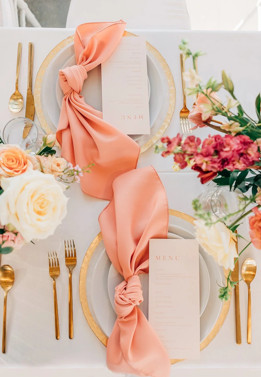
While most of our schedules are booked with wedding planning, every now and then we are lucky enough to work on editorial shoots. They are so much fun to organize and execute, and this one was no exception. The visionary behind the shoot was Adrien with Love Blooms Floral who was inspired by the idea of doing a shoot centered around the Pantone color of the year: Peach Fuzz.
This warm coral color inspiration is so fun because it pairs well with so many other shades. It’s bright and bold with other pinks and pastels, while it’s dramatic and youthful with deep reds and plums.
In this editorial shoot, the color palette we worked with featured bright pinks, yellows, and corals, as well as muted shades like mauve and burgundy. We love that this shoot demonstrates how incorporating big colors into your wedding design can still feel sophisticated and classy. Trends are leaning towards incorporating more color into wedding day celebrations and WE ARE HERE FOR IT. Here are a few tips to help you achieve classy + color.
Create a Cohesive Color Palette
We’ve worked with lots of couples who want to use bold colors but feel intimidated by them or worried that their palette will come across as looking juvenile. The solution to this problem comes through the supporting hues in your palette. Stick to complementary colors or neutral shades, while also limiting your entire palette to three or four main colors.
Select Colors That You Love
Regardless of whether you want bright or neutral colors for your wedding, you should ultimately choose colors that reflect your personal style. As with anything wedding-related, your divisions should be based on what you love, and not always what’s trending. If bold colors are what you’re drawn to, they will feel natural and beautiful because they represent you!
Incorporate Your Colors in Different Ways
Your color palette can be sprinkled throughout a variety of textural elements in your wedding design. Especially when you’re working with bold colors, don’t shy away from incorporating them as much as possible while keeping it intentional. We also have couples who only want a pop of color, so we design that into their aesthetic. Embracing your color scheme through things like florals, table linens, dresses, and even signature drinks can make your choices feel intentional and classy.
This styled shoot represented so many things that we love about being planners, including working with incredible vendors and creating wedding designs that are beautiful, colorful, and sophisticated. PS. Take a look at the individual cakes that Sweetes Bakery made for each place setting- we’re kind of obsessed.
Vendors:
Planning & Design: Everson Events
Floral & Concept Design: @lovebloomsfloral
Photo: @alyssiabphotography
Cake + Mini Guest Cakes: Sweetes Bakery
Venue: The Venue at the Ranches
Stationery: Print Mark
Rentals: Belfiore Rentals
Dress:
Suit:


